Alarming Weather and Climate Trends

100 Years of Climate Data Shows Disturbing Trends
June, 2011
Because it seemed to me that natural catastrophes have been increasing in both frequency and magnitude in recent years, I decided to do a little research, find out if my perceptions are accurate, or just the onset of middle-aged dementia. I gathered data from a number of sources, including Unisys Weather, the National Oceanic and Atmospheric Administration (NOAA), the US Geological Survey (USGS), and NASA's Goddard Institute for Space Studies (GISS). In some cases I lifted graphs directly from the source sites, in others I downloaded the raw data and graphed it using Open Office's Calc program.
Storms and Hurricanes
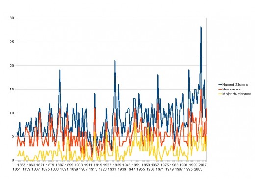
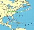
Hurricanes and Tropical Storms
Unisys Weather collects data on tropical storms large enough to earn a name, hurricanes, and major hurricanes. Major hurricanes are those with winds hitting or exceeding 110 miles per hour, and are category 3 or higher on the Saffir-Simpson scale. From the graph, it is easy to see that there has been a gradual but marked increase in the number of named storms. The average number of named storms per year during the first 5 years on record (1851-1855) was 5.8. The average during the 5 years from 2006 to 2010 was 12, more than double the earlier figure. The average number of hurricanes in those same periods also nearly doubled, from 3.8 to 6.4. No data is included for 2011, it will be interesting to see if this year's hurricane season continues to follow the trend.
US Tornadoes
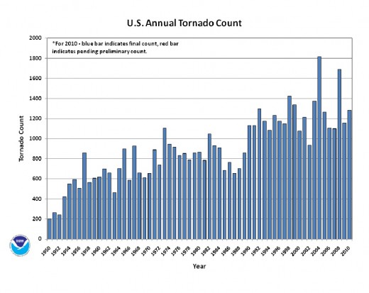
Annual Tornado Counts Rising Significantly
Even more striking than the storm data, information from the National Climatic Data Center shows a significant increase in the number of tornadoes in the United States over the past 60 years. In 1950, the count was 200. In 2010, it was 1300. Some of the increase might be explained by the fact that there are more people around to report tornado sightings, and better technology to detect and track tornadoes. Still, the graph continues to show increases throughout the '90s and beyond. Are you ready for the real kicker? Not shown on the graph is the number of tornadoes in the US so far in 2011. Just half way through the year, and the total so far is 1573, according to the National Weather Service. In just 6 months we've had more tornadoes than all of last year. In fact, it's more than any single previous year except 2004 and 2008.
Earthquake Data

Worldwide Earthquake Counts Trending Upward
As the trend line from this graph from Johnston's Archive shows, the number of annual earthquakes world-wide measuring at least 5.0 on the Richter scale is trending upward. The trend seems pretty gradual at first glance, but keep three things in mind. First, it is worth pointing out that the number increases from 1325 in 1970 to 2117 in 2010, an increase of nearly 60 percent. Second, the trend line would be much steeper, showing a more pronounced increase in earthquake frequency, if we started the graph in 1998 and only showed the last 13 years. Finally, this does not include earthquakes from 2011, such as the the deadly one that hit Japan in March of this year.
Global Average Temperatures in Degrees Celsius

Global Warming
Perhaps the most visually striking graph, this one shows the increase in annual average temperature world-wide. If you click the source link and review the other temperature graphs available from GISS, you can see average temperatures broken down by season, hemisphere, latitude bands, and even the seasons. But they all tell pretty much the same story: the earth is getting warmer. This graph shows the average global temperature ranging from about -.5 degrees Celsius in the early 1880s to about .8 degrees in 2010. This translates to a range of about 31 degrees Fahrenheit to about 33.4 degrees. Even though a change of a few degrees doesn't seem very significant, the warming trend is very pronounced and seems to be accelerating. The graph shows a steeper increase over the last 50 years than that of the 80 years prior.
Few scientists disagree with the fact that the earth is warming up. There is some debate on how much impact we humans have had on the process. I find it interesting that the temperature increase has accelerated as more nations enter the industrial and post-industrial stages.
Further Reading on Climate, Weather, and 2012 Predictions

Interpreting Severe Weather and Climate Changes
Some with a fundamental religious background will look at this data and draw comparisons to the "End Times" as predicted in the Bible, particularly the book of Revelation. “A third of the trees were burned up, and all the green grass was burned up.” (Rev. 8:7). Adherents to the belief that the Mayans predicted the end of the world, or at least, drastic changes in 2012 might be inclined to consider these trends the early indications that the Mayans knew what they were talking about.
Science of course offers a number of explanations more along the lines of geological cycles, sun-spot patterns, and other naturally-occurring phenomenon. A sizable number of scientists also believe that human industry has contributed to global warming, which may also affect some of the other processes mentioned.
My intent is to present the data, and get people thinking and talking about it. I'll leave the explanations to the various experts, but it is clear that something is happening.